In my Firefox (not an obscure browser), this diagram formatted incorrectly, causing the whole column to expand twice as wide as intended to the right. If you include text or diagrams that might screw up formatting, can you please put it in <readmore> tags?
--
[ e d @ h a l l e y . c c ]
| [reply]
[d/l] |
Sorry, your browser is broken beyond what I personally care to work around. The post is a mere <pre> tag with text in it, no further formatting applied. If even this breaks, anything might, and we could wrap the entire internet in <readmore>... Please check and repair your setup.
The 80 characters width is a conscious conservative choice, and the diagram renders correctly on my computer in Firefox, Opera, Konqueror, Internet Explorer, Safari, w3m, Links2, Lynx, Dillo, ... That's all the major browsers and a few obscure ones.
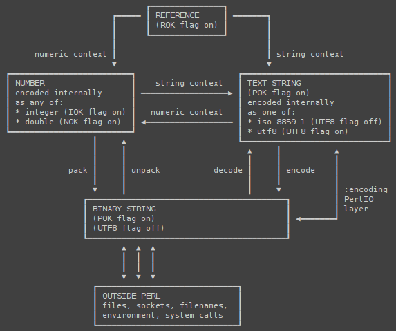
I had reports of some monospace fonts being not-so-monospaced for unicode linedrawing characters (while especially there, it really matters), so I uploaded the screenshot at http://juerd.nl/files/perlvalues.png. I try my best, but I have to draw a line with regards to how far I want to go, and adding <readmore> tags to hide the most important part of this work is well beyond that line.
| [reply] |
It's not that monospace fonts have characters that aren't monospaced, is that very few of them have the necessary characters. When a character is missing, the OS will use an alternate font for that character.
For example, the "Courier New" on this machine doesn't have any of the "BOX DRAWINGS HEAVY" characters (such as U+250F, BOX DRAWINGS HEAVY DOWN AND RIGHT, ┏), only "BOX DRAWINGS LIGHT" characters (such as U+250C, BOX DRAWINGS LIGHT DOWN AND RIGHT, ┌).
You used characters not present in my "Courier New", including "BOX DRAWINGS HEAVY DOWN AND RIGHT". Those characters are being fetched from another font, perhaps Arial, causing the diagram to be distorted.
Had you used only characters present in my "Courier New", such as "BOX DRAWINGS LIGHT DOWN AND RIGHT", the diagram would not be distorted.
So yes, totally a font issue, though not quite the one you described.
| [reply] |
I have to concur with ikegami. Please tell, what monospace font are you using which contains alls those characters? My two usuals, Courier New and Lucida Console, don't.
A word spoken in Mind will reach its own level, in the objective world, by its own weight
| [reply] |